It is the summer break in academia and we are either taking our well earned holidays or preparing material for the next session. A publisher has sent us a bunch of text books to look at - they hope we like them and would recommend them to the students for our courses.
Disclaimer: Whilst we are provided with the textbooks for no personal cost, there are no inducements to promote a particular book or publisher. Each book stands (or falls) on it's own merits.
I have an interest in improving the numeracy and basic data literacy amongst our students, so one of the titles appealed to me. It covered basic arithmetic though various applications in the lab. And one of those specific applications is Enzyme Kinetics.
The Michaelis-Menten equation is one of the foundations of kinetic analysis and the results can be represented in various ways. One of the classical method was developed by Lineweaver and Burk in 1934. It is superficially attractive in that the data is transformed from a hyperbolic curve to a straight line but suffers from reciprocal scaling of the errors. As it is a double reciprocal plot (plotting the inverse of one value against the inverse of the other) small errors in measurement at small values in the test tube become huge errors at huge values in the analysis. The plot has many uses for visualising the data though - identification of mechanism of inhibition is one of the classical examples given in introductory undergraduate lectures.
The problem comes when the plot is used for the determination of the constants (Vmax and Km) rather than their visualisation. Because of the reciprocal scaling of the errors, the estimates can be extremely unsafe (how much so we will get to in a moment). This was recognised by Lineweaver and Burk but this is typically left as an unquantified warning to students to be careful about their errors.
Since 1934 there have been other representations of the Michaelis-Menten equation that transform the data to linear forms. The Eadie-Hoftzee and Haynes-Woolf plots both provide linear transformations though interpretation and extraction of the parameters is marginally more complex than a simple reciprocal of the value of the intercepts on the x and y axes.
More recently the advent of computational methods of direct fitting to the equation removes the issue of error scaling completely and there is no real excuse for not using the direct method in any serious experimental study.
I wanted to see just how well each method would be in reconstructing correctly the correct parameters so constructed a small simulation. Taking a fixed Km and Vmax I can calculate the expected values for V at given substrate concentrations. Needless to say with ideal data every method retrieves the expected values perfectly.
In the lab, however, the world is not perfect. I therfore add fixed errors corresponding to measurement errors as one might find on reading a typical UV/Vis spectrometer, and proportional errors such as might be expected from pipetting. I repeat each experiment 10 times and calculate mean/SD for the parameters. The calculations for the Lineweaver-Burk plot are performed with no error weighting, such as might be done in a typical undergrad classroom.
The results are clear. Lineweaver-Burk is giving extremely poor results - so much so that one would never consider it for any analysis.
The simulation can be found here (PDF) (R Source [latex]) if you want to work through it yourself. I recommend the RStudio IDE and you will need appropriate software for Sweave/Latex.
So back to the book. They provide a suitable treatment of the Michaelis-Menten equation but the only experimental treatment for determining the kinetic constants is the Lineweaver-Burk plot, with a cursory half sentence hinting that it may not be suitable. There is no consideration of alternative approaches. It is a pretty damning effort - the book is otherwise quite approachable and could otherwise be recommended, but serious errors where we have to correct the textbooks render it unacceptable. I'm not going to name the book or publisher, but will be contacting the authors directly.
Tuesday, 31 July 2018
Friday, 24 June 2016
Using Map data in R
Maps are useful things and R is a useful thing, so it would seem a natural useful thing to get them to work together. However, maps are far more complex that we might think and dealing with them in R can be a bit interesting.
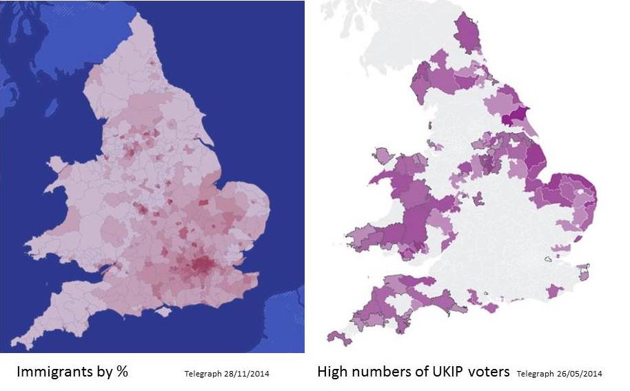
I started looking for map data to follow up a discussion on the correlation between votes for a far-right wing party (UKIP) and lack of exposure to immigrants. The recent UK elections have provided a wealth of data, and figures like these suggest that there may be a correlation.
Data for voting patterns in May 2013 can be obtained from the electoral commission at http://www.electoralcommission.org.uk/our-work/our-research/electoral-data
Data for the recent census can be retrieved from http://www.nomisweb.co.uk/census/2011/KS204EW which gives the country of birth at a local authority level.
The Electoral data is an Excel file that is nicely split and formatted in a way that makes it difficult to read directly into R. However, by spending a few minutes editing out the subheadings and copying the regional names to a new column, I have a tab-delimited file that gives me the electoral votes by local authority.
So this gives us the votes data and this can then be merged with the regional census data.
A plot is straightforward, as is a regression analysis.

I started looking for map data to follow up a discussion on the correlation between votes for a far-right wing party (UKIP) and lack of exposure to immigrants. The recent UK elections have provided a wealth of data, and figures like these suggest that there may be a correlation.
Data for voting patterns in May 2013 can be obtained from the electoral commission at http://www.electoralcommission.org.uk/our-work/our-research/electoral-data
Data for the recent census can be retrieved from http://www.nomisweb.co.uk/census/2011/KS204EW which gives the country of birth at a local authority level.
The Electoral data is an Excel file that is nicely split and formatted in a way that makes it difficult to read directly into R. However, by spending a few minutes editing out the subheadings and copying the regional names to a new column, I have a tab-delimited file that gives me the electoral votes by local authority.
origins<-read.csv('bulk.csv',stringsAsFactors=F)
origins$geography <- toupper(origins$geography)
names(origins)[c(5:16)]<-c('All','UK','England','Northern.Ireland','Scotland','Wales','UK.Other','Ireland','EU','EU2001','EU.New','Other')
votes<-read.table('EPE-2014-Electoral-data.txt', header=T, sep='\t')
votes$Local.Authority<-toupper(votes$Local.Authority)
regions<-merge(votes,origins, by.x='Local.Authority', by.y='geography')
So this gives us the votes data and this can then be merged with the regional census data.
A plot is straightforward, as is a regression analysis.
UKIPvote<-100*regions$UKIP/regions[,4]
NonUK<-(regions$All.y-regions$UK)*100/regions$All.y
plot(UKIPvote~NonUK, xlim=c(0,60), ylim=c(0,60), xlab='% non-UK born',
       ylab='UKIP vote (%)', main='Anti-immigrant vote vs population composition')
abline(lm(UKIPvote~NonUK), col=2)
summary(lm(UKIPvote~NonUK))
Call:
lm(formula = UKIPvote ~ NonUK)

Residuals:
     Min       1Q   Median       3Q      Max
-12.0187  -3.6868  -0.1728   3.3297  14.5318

Coefficients:
            Estimate Std. Error t value Pr(>|t|)
(Intercept) 34.17057    0.67626   50.53   <2e-16 ***
NonUK       -0.49421    0.03117  -15.86   <2e-16 ***
---
Signif. codes:  0 ‘***’ 0.001 ‘**’ 0.01 ‘*’ 0.05 ‘.’ 0.1 ‘ ’ 1

Residual standard error: 4.956 on 116 degrees of freedom
Multiple R-squared:  0.6843, Adjusted R-squared:  0.6816
F-statistic: 251.4 on 1 and 116 DF,  p-value: < 0.00000000000000022
Looks good to me - fear of strangers leads to reactionary politics.
Now to recreate the maps. This is where it starts to get interesting.
Now to recreate the maps. This is where it starts to get interesting.
Map data for the UK at local authority boundary level is not readily available. Datasets are at ward level or higher level regions. So I will need to read in the ward data and merge the local authorities so I can plot the electoral data. The frame of reference is latitude and longitude for the polygon coordinates.
ONS census ward (merged wards) data is available from http://www.ons.gov.uk/ons/guide-method/geography/products/census/spatial/2011/index.html. This downloads as a zip archive that unpacks into a folder containing multiple files with the same root filename. These are ARCGIS SHAPEfile format. Get the full resolution file as the generalised one fails to merge wards properly.
The R package maptools is used to read them. Whilst you are at it also install the libraries rgeos, rgdal and gpclib to process the data. Set your session to the directory containing the data files and read them in.
library(maptools)
library(rgeos)
library(rgdal)
library(gpclib)
GPClib is proprietary and licensed for non-commercial use. To enable it type
gpclibPermit()
wards <-readShapePoly("CMWD_2011_EW_BGC")
This gives the ward boundaries and these can be plotted readily using the shapefile objects plot command.
plot(wards) #this could take a while so try plotting a selection
plot(wards[1:20])
This datafile contains the local authority name. However, we need to merge the datafiles to local authority. That can be done by unifying individual polygons (dissolving in shapespeak) to anew boundary list where the id is the local authority name.
So I process the data local authority by local authority until I find the error
for(x in levels(wards$LAD11NM)){
try( {
cat(x);
lamap<-unionSpatialPolygons(wards[wards$LAD11NM==x,],
wards$LAD11NM[wards$LAD11NM==x]);
})
}
lamap <-unionShapePoly(wards, wards$LAD11NM)But this gives an error.
So I process the data local authority by local authority until I find the error
for(x in levels(wards$LAD11NM)){
try( {
cat(x);
lamap<-unionSpatialPolygons(wards[wards$LAD11NM==x,],
wards$LAD11NM[wards$LAD11NM==x]);
})
}
This lists all the LA names as we go and the errors so it is clear to see which ones are providing problems. It does take a long time to process Wales - the coastline is quite challenging.
In total there were 5 local authorities who showed errors. I now have two options:
1. Fix the errors
2. Work round them by plotting everything except the problem ones and plotting them as wards.
I give up with 1.
With 2 I can use the R subset command to select the good wards and merge those. That leaves the bad wards to plot on top of them afterwards.
goodwards<-subset(wards, !(wards$LAD11NM== 'Bridgend'| wards$LAD11NM=='Gwynedd'| wards$LAD11NM=='Isle of Anglesey'| wards$LAD11NM=='Newcastle-under-Lyme'| wards$LAD11NM=='Oxford'))
badwards<-subset(wards, wards$LAD11NM== 'Bridgend'| wards$LAD11NM=='Gwynedd'| wards$LAD11NM=='Isle of Anglesey'| wards$LAD11NM=='Newcastle-under-Lyme'| wards$LAD11NM=='Oxford')
Now I can merge the good ones.
lamap<-unionSpatialPolygons(goodwards, goodwards$LAD11NM)
And plot
plot(lamap)
plot(badwards, add=T)
Now we'll work on colouring them by the data.
And I should update this for the EU referendum..
Monday, 1 December 2014
Moving House
This blog has moved from inside the Univoersity of Dundee VLE to outside as accessing it was proving to be, shall we say, suboptimal. Now the whole world can see.
I will move most of the posts over in due course.
I will move most of the posts over in due course.
Subscribe to:
Posts (Atom)